My contribution: User research, UX design, Product management
Length: 4 months
Project Type: Company Project

My contribution: User research, UX design, Product management
Length: 4 months
Project Type: Company Project
Mogujie is a fashion e-commerce platform with more than 10 million daily users. When I worked as a product manager for the Fashion Content Module at Mogujie, I uncovered the discrepancy between customers’ goals and the current design by noticing a pattern: customers kept requesting links to items. Therefore, I redesigned the user flow and visual elements of the module, which resolved the problem and increased the average session duration of the module by 82%.
(To comply with my non-disclosure agreement, I have omitted and obfuscated confidential information in this case study.)
As an e-commerce platform developed from a shopping guide platform, fashion content has always been our biggest advantage and difference from other e-commerce platforms. Our target customer is young women who love fashion. They can view high-quality fashion contents and buy them if the content has associated items.
When reviewing customer comments under fashion content and user feedback, I found that many customers were requesting links in comments, even for content with associated items. In the background of feedback, some customers even said, "I do not want to see fashion content without item links."

This was puzzling to me. It is the best when fashion content has associated items, but even without items, the content still can help customers learn how to match clothes. Why would this cause aversion? Do customers just want to see items rather than fashion content? I conducted some customer research to solve my doubts.
I contacted several customers who gave related feedback, participated in a focus group interview with eight customers and conducted a survey to collect opinions from 1,652 customers, and I analyzed the research results.


Most customers view "Fashion Content" with the hope to buy them;

If there are no exact matching items, they would like to see and buy similar items;

"Cannot find the right match" can be a factor in stopping a purchase.

Customers acknowledge the value of fashion content to help them learn to match clothes, but there are other better and more convenient ways, such as social networks and TV.
In the repeated analysis, discussion and communication with customers, I realized: What customers want is not to "learn how to match clothes". Most people do not have time to study about what color, elements, or style is more suitable for themselves, and then pick the right product.
What they really want is "to be beautiful," and the easiest way to achieve this is to imitate: to find a look they like and to buy it. This is why some people do not find it helpful when they see beautiful looks but cannot buy them. They feel they are wasting their time.
In summary, the customers’ goal of the fashion content module is not to "learn how to match clothes", but "to find beautiful looks they like and buy them".
Based on this goal, our current product structure has been praised by customers for helping them find beautiful looks. However, there are many problems in the connection between "finding looks" and "buying items". The connection now is not very obvious.
The problem we need to solve is:
I discussed this idea with my mentor Li Hao and got her support. I started discussing the solution with two UI designers, and I kept communicating with developers, algorithms and other technical teams.
I organized a small brainstorming session to discuss what we could do. Finally we decided to redesign from these aspects:

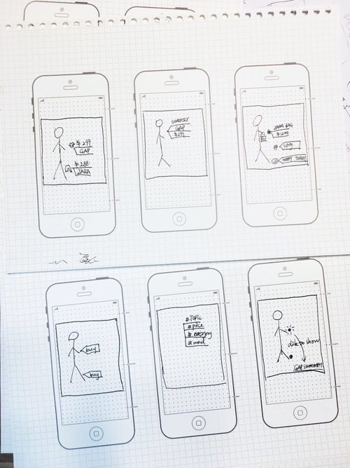
I tried a variety of paper prototypes, and after testing, and selected three of them to refine and compare.

According to the vote in our beta user group, the most popular plan was the first one, but it had a potential problem: the information on the picture might negatively affect its look, so I made a lot of attempts to see if we could solve this problem.
We did a test to determine the priority of item information for customers, and the result shows: Price> Brand> Category> Other.

Then I used the real picture to make prototypes and do testing:

Finally, I worked with UI designers to determine the UI and set the rules for displaying information on pictures. In order to balance the items information and visual effects, each item must show its price and purchase icon, and the publisher decides whether or not to display its brand and category.

We are all very excited about this design; it‘s just like a magic tag!

At the beginning of the design, I talked to the algorithm team about the possibility of matching similar items based on fashion content pictures. After nearly two months of data training and testing, the accuracy of the algorithm achieved more than 92%, so we used the algorithm directly to match similar items.

I analyzed the previous user flow of customers from "finding looks" to "buying items." We can see the user flow is very long, and it is a one-way process. If customers do not like an item, they have no choice but to go back to the last page.

I decided to make good use of tags. By using tags and tag pages, we greatly shortened the purchase path, and customers could continue shopping around between content and items, without having to return to the previous page.

After identifying the basic prototypes and logic, I began refining the page structure and interaction flow, adjusting page effects with UI designers, designing corresponding operational background, reviewing with developers to ensure the viability of the solution, addressing newly discovered problems in the refinement and developing data monitoring plans.
Requirement Review

Part of Product Requirement Document

The entire project lasted 3 months. After the coverage rate of the new version was stable, we got some results: